Can one graph capture the economic vibes?
The labor market is on track to return to the pre-stimulus equilibrium
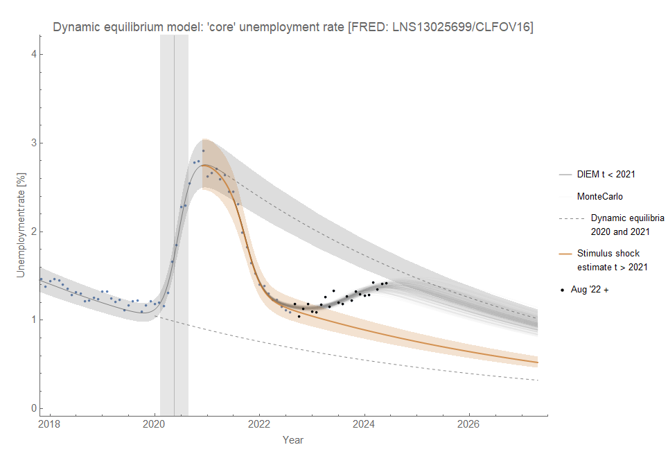
I’ve been calling it the “littlest recession” — it’s only on the order of ~1/3 the size of the early 2000s recession. However, it appears to be continuing. No dramatic increase in the rate, but not much of a slowdown either. The Monte Carlo shows a “coincidental1” return to the pre-stimulus equilibrium2:

Instead of the “littlest recession”, it may just be the fading effect of the pandemic stimulus — the economy returning to the pre-stimulus status quo. The fact that the data seems headed straight towards the pre-stimulus equilibrium lends credence to that argument. This one graph showing a mild rise in unemployment could be behind a lot of the “vibes-cession” takes, but it just doesn’t seem sufficient to explain either the magnitude or the details. Objectively, the economy is not in equilibrium — if that equilibrium is defined by a log-linear decline in the unemployment rate3.
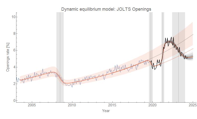
Of course, I made more than one graph. But the JOLTS data is showing something similar — if not worse. Openings have yet to solidly reach their new dynamic equilibrium and it’s at a level below the pandemic shock:

There is some uncertainty in the measurement and model estimate of the equilibria, so while the data for openings (and quits) is below the line it could still be consistent with it. Regardless, JOLTS is not showing anything significantly better than the unemployment data.
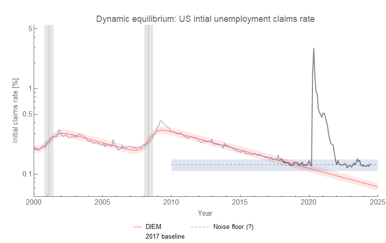
The one time series that continues to be (seemingly) useless is initial claims. I speculated that the data may be up against a “noise floor” — measurement error and the normal random churn in an economy mean a claims rate4 never can go below 0.10-0.15%5. Think of this as the “hiss” of your stereo that never goes away but rather is only overcome by the signal (in the case of initial claims, recessions).

The optimistic scenario is that unemployment will rise back to the pre-stimulus equilibrium before returning to its usual log linear decline. That would be, in terms of headline unemployment, about 4.5% by the end of 2024 or early 2025. The pessimistic scenario, and one we do not want to see due to its political implications in this particular election year, is that unemployment will begin to rise faster as part of a non-equilibrium shock — i.e. a real recession. I think the optimistic scenario is more likely based on some evidence of flattening out in the JOLTS data6. Let’s hope.
I talked more about this “coincidence” in the previous labor market update.
In the Dynamic Information Equilibrium Model (DIEM), “equilibrium” is a (log-linear) growth rate or rate of decline. A line of a given slope can appear at different levels — I refer to those lines of log-linear growth or decline as different “equilibria”. However, since they have the same slope (in the model) they all represent an economy in “equilibrium”.
(d/dt) log u ~ −0.09/y as noted by me (here in 2018, working out the theory here in 2017) as well as in Hall and Kudlyak (2020)
Initial claims rate is ICSA / CLF16OV if you speak FRED. It is the number of initial claims per member of the civilian labor force.
Note that 100% / √(500,000) = 0.15% and 500,000 is comparable to the average non-recession level of initial claims (~300,000). It has the right statistical size to be measurement error.
JOLTS tends to lead unemployment, at least in terms of non-equilibrium shocks.


really interesting thank you