Latest data telling the same story as last [insert unit of time]
Don't let that stop you from producing a new grand narrative, though.
GDP and initial claims data came out this morning and for the most part there’s not much new to say about it. Boring, I know — but boring is what you want from macro.
We’ll start with initial claims. With all the news of tech company layoffs (e.g.), people see the initial claims data and try to rationalize why it’s falling. Well, the big companies’ announcements (Facebook, Google, Microsoft, Amazon) only amount to ~50k jobs over the course of January so back of the envelope says that’s ~12.5k jobs per week while initial claims an order of magnitude higher fluctuating around ~200k per week. It’s small. Also, these companies typically give severance so people may or may not start collecting unemployment. Plus tech jobs are still in demand with job openings fairly high so many may just get another job before making their initial claim.
However, most of that is just-so explanation — to try to model initial claims based on all of that information would not only be a complex Rube Goldberg device but the result would likely be impossible to reject. That’s why I think the “noise floor” view is the best way to frame the data for now. Recent data bumps up and down because there’s always a certain amount of churn in an economy (plus statistical error) so no initial claims number will be meaningful until it starts to exceed ~250k/week (or ~0.15% of the labor force).

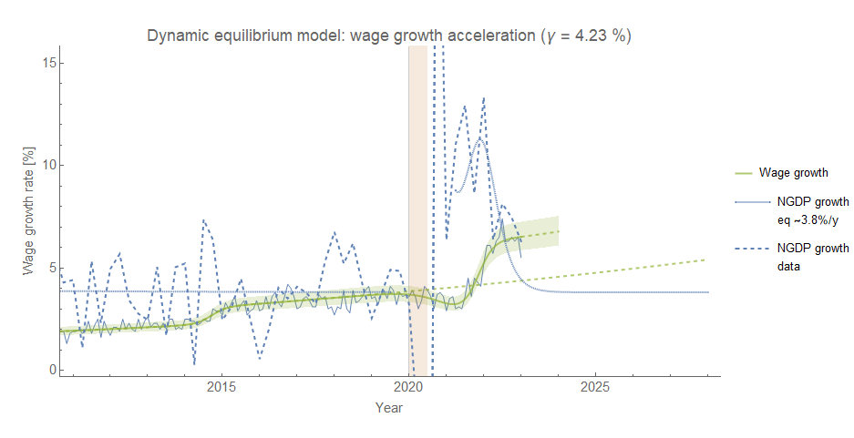
The path of GDP growth is consistent with a slow return to the 3.8%/y dynamic equilibrium rate (it’s an incredibly noisy series and it takes years to get a handle on the trend). In addition, the latest wage growth from the Atlanta Fed wage growth tracker shows a pretty large drop. It’s a single data point — there was a fluctuation as large in the opposite direction several months ago.
However, we’re still roughly in a place where nominal GDP and nominal wage growth have met up — the limit to wage growth hypothesis1 would still say a recession is 1-3 quarters in the future of the crossing point. That point is around Q3 of 2022, so we’d be looking at anywhere from now until Q2 of 2023.
In my post on JOLTS data from the beginning of January, I used the apparent correlation between the dynamic equilibrium models for hires, wage growth and unemployment to forecast unemployment based on hires:
The result showed unemployment was currently undershooting or lagging that estimate (or a combination of both). However, using hires to forecast wage growth shows the latest data from the Atlanta Fed wage growth tracker is much more consistent:

It’s still only a single point, so we’ll have to monitor this going forward. It does mean that the initial assumption that Hires → Unemployment → Wage Growth causal chain with lags of ~5 months and ~6 months (± 1-2 months) might not be correct. Instead, there might be separate chains Hires → Unemployment and Hires → Wage Growth with independent lags — a fall in wage growth might arrive “on time”, but the fall in unemployment is delayed.
One reason why this may be true is that getting a new job is often accompanied by higher wages — “job switcher” wage growth outpaces “job stayers” by several percentage points. Therefore in a fairly direct way a fall in hires means a fall in the number of job switchers — thus slower aggregate wage growth.
In contrast, the matching function is a combination of unemployment, vacancies, and hires where there are several labor market factors coming together creating far more uncertainty in the chain from a fall in hires to a rise in unemployment. Again, this is a just-so story but we’re only examining plausibility here to show how the forecasts might fail2. There's still not enough data to say the forecasts are inside or outside of their uncertainty.
As has been a pretty steady mantra on this blog: the latest data basically tells the same story the point from the previous time step — be it months, quarters, or years. Single data points aren’t informative but can be generative. The drop in wage growth prompted me to look at how the Hires → Wage Growth chain was working and examine the forecasts more carefully. A new data point in a time series often isn’t a new path itself but a potential fork — los senderos que se bifurcan.
Update 2023-01-27
Some additional data — Personal Consumption Expenditures (PCE) and median house prices.
Core PCE inflation3 continues show a return to normal:
PCE — again, like the data above no real change to the outlook except the estimate of the final level shifting by a few pixels.
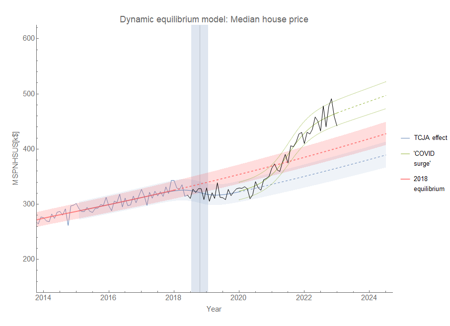
The surge in median sales prices of new houses (MSPNHSUS) is showing a similar slowing towards the equilibrium growth rate at a higher level:
When NGDP growth and nominal wage growth coincide, a recession empirically follows 1-3 quarters later for the past 3 “normal” recessions (1991, 2001, and 2008) as well as in 2020. Possible mechanism includes e.g. firms pulling back on investment as wages start to eat into profits.
Another more complex mechanism for error is that the positive (beneficial) shocks to hires, unemployment, and wage growth have a different lag than the negative (detrimental) shocks. Beneficial shocks may quickly find their way from rising hires to a fall in unemployment or rising wage growth while detrimental shocks proceed more slowly. However, given the limited number of beneficial shocks in the time series (only the pandemic stimulus/re-opening and the 2014 mini-boom appear in the available data, with the former essentially being used to time the negative shock above).


