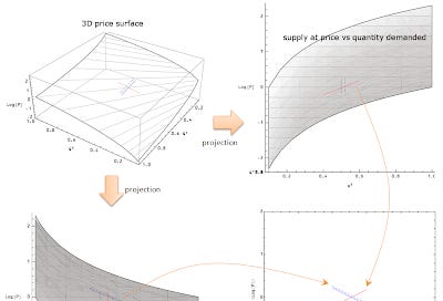
What is a supply and demand diagram, anyway?

Here is the process for how you construct a supply and demand diagram in the information transfer model. You start with a 3D surface (think $x,y,z \rightarrow Q^d, Q^s, P$) defined by $$ P = \frac{1}{\kappa}\frac{Q^d}{Q^s} $$
and perform two projections into the $(Q^d , P)$ and $(Q^s , P)$ planes. You keep the line that "varies". For example, in the $(Q^s , P)$ plane, the supply curve doesn't vary with the quantity supplied because it is the set of points on the surface where $Q^s = \text{const}$ that includes the equilibrium point where the curves cross. This means the red supply curve appears as a vertical line, but the demand curve falls with increasing quantity supplied. The opposite goes for the projection in the $(Q^d , P)$ plane: here the demand curves are constant versus demand while the supply curves vary with the quantity demanded.
The dashed line represents a shift in the demand curve (it appears as a vertical line shifted to the right in the $(Q^d , P)$ plane).
Not all supply and demand diagrams look like the basic one. For example, sometimes you project both curves into the same plane (e.g. here). However, I think this is a good way to get a handle on the various ones that appear out there.


