


Overfitting and empirical data: qualitative and qualitative models

John Handley has a counterpoint to my draconian empiricism. It brings up an interesting point: what do you do in a world where error is a given and you have to make a model more complex than the data can reject to even be a qualitative success?
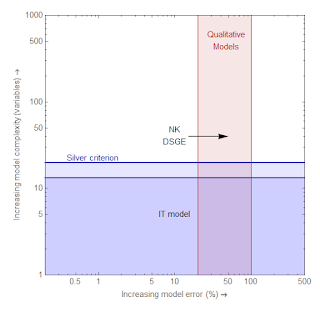
I tried my hand at a diagram:

Let me unpack it.
(Nate) Silver criterion: This is an arbitrary complexity criterion for good models -- about 1 parameter per 15-20 points of data. Models above this line cannot be rejected given the current empirical data. Models above this line tend to overfit, and therefore drift to the right over time. This horizon also rises over time as more data becomes available. I based this line on the number of quarterly points in a post-war time series.
Data horizon: The maximum amount of data that will be available in the near future. Models above this line will likely never be rejected by empirical data on a reasonable time scale.
Qualitative models: Models that get the directions of effects right, but are off by factors of order 2.
The modeler's compass: These arrows indicate the available directions a model can move. Improvements reduce error but increase complexity. Overfitting causes a model to drift to the right as more data becomes available. Errors can also improve over time as more data becomes available.
I put the NY Fed DSGE model and the IT model on here as examples.
Let's consider a few cases ...
X1: Making a terrible model a terrible qualitative model. Adding complexity to something complex that doesn't work doesn't make things better. This model should be abandoned.
X2: Making a terrible model an acceptable qualitative model. Adding complexity to something simple that makes it work qualitatively is acceptable modeling.
X3: A model so complex, data will never be able to reject it. This is garbage.
Now John gives us a scenario:
This same problem is captured by the failure of NK DSGE models to explain the Great Recession; the only conclusion that can be drawn from the empirical evidence is that the model is incomplete, which everyone already knew anyway, and therefore failed to capture all the possible causes of the Great Recession -- this has no bearing on the correctness of the rest of the model.
How do we represent this on our diagram? Let's take the NK DSGE model to start at the location of the NY Fed DSGE model. The great recession was essentially a large jog to the right -- into the red area ... like this:
Whether this is acceptable really depends on whether the model was more or less complex than the Silver criterion. If it was more complex, then we should think of the previous success as a case of overfitting: i.e. the model is garbage. If it is less complex, then it could be overfitting or it could just have been a qualitative model to begin with.
John makes the case that it is the latter: DSGE models are qualitative models. I don't buy this. For one, they are way too complex to be a qualitative model. Qualitative models above the Silver criterion basically overfit the data and are useless. They're not really telling you anything besides parroting back your priors.
The current state of affairs is that most of the DSGE models are already way too complex to be rejected (according to Noah Smith), therefore adding complexity to deal with an increase in error is a sign of a degenerative research program.
...
PS John also talks about never having a closed system in economics. However, any system can become an effective closed system if your instrumental variables move faster (move a greater magnitude in a shorter period of time) than your unobserved variables. That's why QE was such a good experiment!