


Growth state diagrams

I wanted to show the plausibility of these "growth state diagrams" (here, here, here or here):
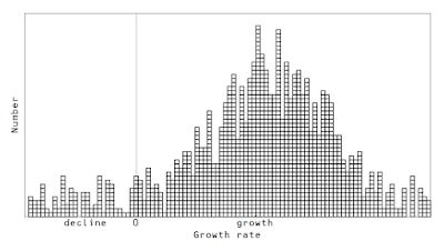
... using real data. Therefore I grabbed some CPI component data (as a proxy for growth) and plotted the histogram of CPI component inflation rates over time (past 10 years) in an animation (data from here):
