


Dynamic equilibrium: consumer sentiment

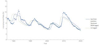
I looked at the University of Michigan's consumer sentiment index for signs of dynamic information equilibrium, and it turns out to be generally well described by it in the region for which we have monthly data [1]

The gray dashed lines are the dynamic equilibria. The beige bands are the NBER recessions, while the gray bands are the shocks to consumer sentiment. There might be an additional shock in ~ 2015 (the economic mini-boom) but the data is too noisy to clearly estimate it.
Overall, this has basically the same structure as the unemployment rate — and in fact the two models can be (roughly) transformed onto each other:

The lag is 1.20 y fitting CS to U and −1.24 y fitting U to CS meaning that shocks to sentiment lead shocks to unemployment by about 15-16 months. This makes it comparable to the (much noisier) conceptions metric.
Of course, this is not always true — in particular in the conceptions data the 1991 recession was a "surprise" and in the sentiment data the 2001 recession was a surprise. It's better to visualize this timing with an economic seismogram (that just takes those gray bands on the first graph and puts them on a timeline, colored red for "negative"/bad shocks and blue for "positive"/good shocks):

As always, click to enlarge.
Note that in this part of the data (and as we'll see, the rest of the data), CS seems to largely match up with the stock market. I've added in the impossibly thin shock in the S&P 500 data (along with a boom right before that looks a bit like the situation in early 2018) in October of 1987 — the largest percentage drop in the S&P 500 on record ("Black Monday", a loss of ~ 20%). Previously, I'd left that shock out because it's actually very close to being within the noise (it's a positive and a negative shock that are really close together, so it's difficult to resolve and looks like a random blip).
If we subtract out the dynamic equilibrium for consumer sentiment and the S&P 500, and then scale and shift the latter, we can pretty much match them except for the period between the mid 70s and the late 90s:

Remarkably, that period is also when a lot of other stuff was weird, and it matches up with women entering the workforce. It does mean that we could just drop down the shocks from the S&P 500 prior to 1975 into the consumer sentiment bar in the economic seismogram above.
I don't know if anyone has looked at this specific correlation before over this time scale — I haven't seen it, and was a bit surprised at exactly how well it worked!
...
Update 22 December 2019
Noah Smith tweeted a bunch of time series of surveys, so I took the opportunity to see how well the DIEM worked. Interestingly, there may be signs of running into a boundary (either the 100% hard limit, or something more behavioral — such as the 27% 'crazification factor'). Click to enlarge as always. First, the Gallup poll asking whether now is a good time to get a quality job:


And here is the poll result for the question about the economy being the most important issue in the US:


Both of these series are highly correlated with economic measures — the former with the JOLTS job openings rate (JOR), the latter with the unemployment rate:


...
Footnotes:
[1] Since many shocks — especially for recessions & the business cycle — have durations on the order of a few months, if the data is not resolved at monthly or quarterly frequency then the shocks can be extremely ambiguous. As shown later in the post (the S&P 500 correlation), we can look at some of the other lower resolution data as well.