CPI and DIEM inflation forecasts
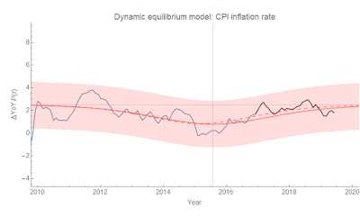
Apropos of getting into an argument about the quantity theory of money on Twitter, the new CPI data came out today — and it continues to be consistent with the Dynamic Information Equilibrium Model (DIEM — paper, presentation) forecast from 2017. Here's year-over-year inflation:

The red line is the forecast with 90% error bands (I'll get to the dashed curve in a second). The black line is the post-forecast data. The horizontal gray line is the "dynamic equilibrium", i.e. the equilibrium inflation rate of about 2.5% (this is CPI all items), and the vertical one is the center of the "lowflation" shock associated with the fall in the labor force after the Great Recession. Shocks to CPI follow these demographic by about 3.5 years.
Back to that dashed curve — the original model forecast estimated the lowflation shock while it was still ongoing, which ends up being a little off. I re-estimated the parameters a year later and as you can see the result is well within the error bands. The place where it makes more a difference visually (it's still numerically small) is in the CPI level:

Without the revision, the level data would be biased a bit high (i.e. the integrated size of the shock was over-estimated). But again, it's all within the error bands. For reference, here's a look at what would have looked like to estimate a bigger shock in real time — unemployment during the Great Recession.
...
PS/Update +10 minutes: Here's the log-derivative CPI inflation (continuously compounded annual rate of change):


