Australia, the UK and the EU
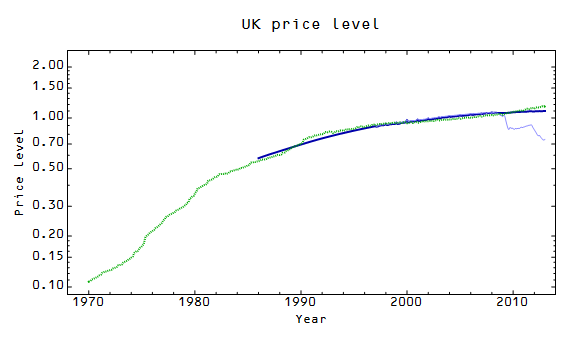
What do these regions have in common? I'm updating the price level fits for them! The old fits are at these links: Australia, UK, EU. And here are the new fits:


In the UK one, you can see the improvement (dark blue) relative to the old fit (light blue). Australia represents an improvement as well. The EU fit seems to have gotten worse; the likely culprit is the fact that the currency base included other currencies (like the Italian lira) for a bit of time that aren't included. The big deviation in 2002 (when the switch happened for many EU countries) throws off the overall fit. You can't win them all.


