


About that graph ...

There's a graph I've seen around the internet (most recently from Timothy B. Lee on Twitter) that contains the message: "The earlier you abandon the gold standard and start your new deal, the better ..." typed over a graph from Eichengreen (1992):
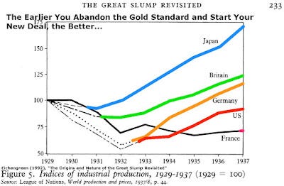
Looks pretty cut and dried, but I'd never looked at the data myself. So I thought I'd have a go at figuring out what this graph looks like outside of the domain shown. First note that this is a graph of an industrial production index, not NGDP, normalized to 1929. The data was a bit difficult to extract; some is just from FRED, others digitized from the graph itself and a few extra points from Japan come from this interesting article from the BoJ [pdf] about economy during this time period. The results make the case a little less cut and dried (colors roughly correspond):

The graph at the top of this post is shown as the gray dashed line. First, with the other data, it is hard to say anything much is happening in the UK:

The UK actually pegs its interest rate at 2% in the period of the gray bar (which seems to generate inflation), but the overall picture is "meh". However, in that article above, we learn Japan actually started a "three-arrow" approach (similar to the one employed in Abenomics) in 1931 that included pegging its currency to the UK (gray bar in graph below):

Now pegging your currency to another is abandoning the gold standard (at least if the other currency isn't on the gold standard, which the UK didn't leave until later according to the graph -- when it also started pegging its interest rate). Additionally, in 1931, Japan's military build up that would eventually culminate in the Pacific theater of WWII began (remember, this is an industrial production index). Military build up (starting in 1933) and pegged interest rates (gray) could be involved in Germany as well:

We can pretty much leave France out of the conclusion of the graph at the top of the page because there's really no data. That leaves the US:

The pegged interest rates (gray) don't seem to have much to do with the highlighted red segment (see more here about the US in the Great Depression and the Veterans bonus; see also here and here about the period of hyperinflation and price controls), but the New Deal, started in 1933 probably does. It could be the gold standard, but having both happen at the same time makes it hard to extract the exact cause. In fact, you could even say this is just a relatively flat random walk from 1920 until the US military build-up starts in 1939. Without WWII, I could have seen this graph continuing to the right with periods of rising and falling industrial production.
So what looks like a cut and dried case about the gold standard may have much more to do with fiscal policy than monetary policy. In fact, what seemed to happen was that bunch of different policies were tried and we still can't quite extract which one did what -- the answer is likely a muddle of fiscal and monetary policies. And we haven't even gotten to whether industrial production is the right metric.