


A challenge to macroeconomists

In light of my comments on this post by Scott Sumner who declares victory without having specified anything quantitative at all, and pursuant to a discussion with Tom Brown on this post where I brought up something I have noticed in my efforts to build up a macroeconomic model, I'd like to make a point. It appears no economist has ever actually compared a theoretical model of inflation to empirical data. I've tried to find other cases with which to compare my efforts (my efforts are here, here and here, for example), and the best I've come up with is this analysis from 1983:

It's from Principles of Economics, Volume 1 by Mankiw. Even this is taking "theoretical model" fairly loosely. First off, these graphs don't even appear in the original paper by Sargent. Second, the graphs only loosely imply that P = k M, however economists don't actually believe the k in that equation is constant. Third, this only covers a four years of the post WWI hyperinflation.
This puts not just DSGE fans in the realm of being like string theorists [1] in physics (theoretical models with no contact to data), but in fact all macroeconomists since, well, Walras.
My challenge/request/bleg is simple:
Produce a graph with an empirical measure of the price level (or inflation rate*) and a theoretical curve.
It can be any measure of the price level (here is an example from FRED). Just give me some data points with a line near it (it doesn't even have to go through the data points).
Maybe there are a bunch of such graphs in gated economics journals. I highly doubt it. I don't believe they exist. Why? Because when I do a Google image search on "price level model" (without the quotes, even) I get back my own #$%@ graphs!!!
You might want to send me this graph from Nick Rowe:

I see your ad hoc monetary-policy-can-hit-any-inflation-target-it-likes model (that isn't even accurate) and raise you the interest rate (link):


I'd really prefer something that isn't a straight line. Actually, I'd really like to see results for Japan. Here are mine (oh, with an interest rate model of course):


Did I mention that it's the same model as the one used for the Canadian graphs above? [2]
[1] Don't get me wrong. I love string theory.
[2] Hopefully this post is taken as good-natured ribbing, or at least good-natured snark.
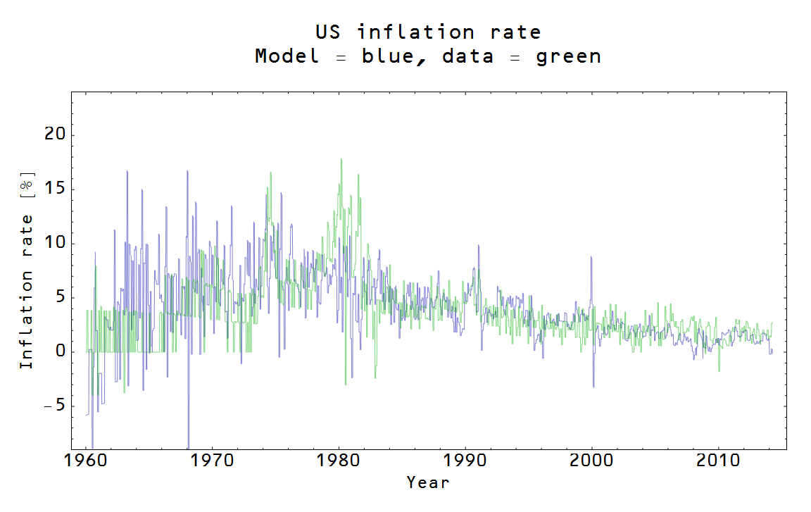
*Update 7/3/2014. Nick Edmonds makes a good point (H/T Tom Brown) that economists tend to look at the inflation rate rather than the price level. To that end, I'll expand the challenge to price level or inflation rate. Here is one for the US from me:
Here are results for Japan. Here are some "out of sample" results for the US (predicting today's low inflation from data in the 1970s). Here are some more general considerations, extracting the general trend towards lower inflation.
Macroeconomists, you're "On Notice" :)
Update 7/3/2014 This one (on inflation) is pretty good from the NY Fed:

Update 7/3/2014 Not for nothing, the NY Fed model has 42 (!) parameters. The information transfer model (ITM) has 3. Additionally, the NY Fed results were "smoothed", whereas the ITM results were not.