


3D visualizations of the interest rate model


The IT interest rate model results in the formula
log r = a log N – a log M – b
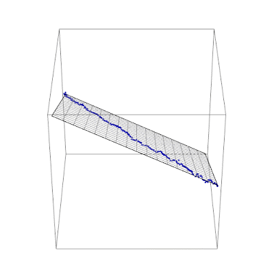
where N in nominal output (NGDP), M is the monetary base minus reserves, and a ~ 2.8 and b ~ 11.1 (pictured above). This formula represents a plane in {log N, log M, log r} space. If we wrote it in terms of {x, y, z}, we'd have
z = a x – a y – b
And we can see that the data points fall on that plane if we plot it in 3D (z being log r, while x and y are log N and log M):
Update + 4 hours
I thought it might be interesting to "de-noise" the interest rate in a manner analogous to Takens' theorem (see my post here). The basic idea is that the plane above is the low-dimensional subspace to which the data should be constrained. This means that deviations normal to that plane can be subtracted as "noise":


The constrained data is blue, the actual data is green. This results in the time series (same color scheme):
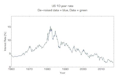

The data is typically within 16 basis points (two standard deviations or 95%) of the de-noised data.